
Ocado’s Checkout Flow Feels Like Git: And That’s a Problem
I've been a loyal Ocado customer for years. Their product selection is excellent, their delivery slots are reliable, and their customer service has always been top-notch. Which is why it's so frustrating that one fundamental aspect of their user experience continues to trip me up, week after week.
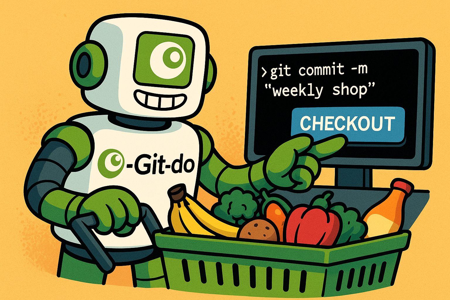
Their checkout flow feels exactly like using Git.
And not in a good way.
The Git Analogy Nobody Asked For
Here's how Ocado works: you have a scheduled delivery order sitting in your account - let's say for Thursday. You realize you forgot to add milk. So you:
- Click "Edit Order" (
git checkout -b edit-order) - Add the milk to your basket
- Click "Check Out" to save those changes (
git commit && git merge)
If you don't complete step three, your changes are lost. You've created a dirty working tree that never made it back to main.
The first time I encountered this, I stared at my screen trying to make sense of it. I wasn't trying to edit my order - I just wanted to add milk. Why does adding a single item require me to enter an "edit mode" and then explicitly "check out" to persist the change?
When Implementation Details Leak Into UX
The term "check out" has a specific meaning in the physical world: it's the moment you pay and complete your transaction. You walk to the checkout counter, hand over your money (or card, or phone), and the transaction is done. The etymology even comes from writing a check or cheque as payment.
Amazon's model respects this mental model: you select items, you check out (i.e., you pay), and they give you a delivery date. Transaction complete. The word "checkout" correctly describes the moment of payment and commitment.
But Ocado has scheduled deliveries. You're not paying now for delivery now - you're managing a future order. So why are they using retail vocabulary for what is fundamentally a shopping-list editing experience?
The answer, I suspect, is that this UX was designed to match the system's internal state machine rather than the user's mental model. Somewhere in Ocado's architecture, there's probably an "order edit session" that needs to be committed. The engineers - or whoever designed this flow - mapped that technical constraint directly onto the UI.
The Uncommitted Changes Problem
Here's where it gets truly bizarre: when you've added products to your order but haven't "checked out," there's zero visual indication that your basket has uncommitted changes.
No banner. No warning. No dirty state indicator.
So every time I visit the Ocado app, I have to manually check whether I'm in the middle of an edit session. Did I add those tomatoes and forget to check out? Or did I already check out last time? The only way to know is to click through the checkout flow "just in case."
This is the UX equivalent of running git status before every operation because you can't remember if your working directory is clean.
A Better Model: Think Like a Human, Not a Database
Here's the thing: this problem is entirely solvable. You don't need to force users to explicitly "commit" changes to their future orders. The UX can - and should - match how people actually think about grocery shopping.
Imagine this alternative:
No "Edit Mode" for Existing Orders
There's no special "order editing session" unless you're creating an entirely new order from scratch. Orders are just persistent lists that you can modify at any time.
Direct Product Actions
When you're browsing products:
- "Add to next order" - instantly adds the item to your soonest scheduled delivery
- "Add to other order" - shows a dropdown or modal: "Add to order on [date]"
No basket. No checkout. Just direct manipulation of your order list.
Inline Removal and Quantity Changes
When you're viewing an order:
- Each product has a delete button
- Each product has +/- buttons to adjust quantity
- Changes save immediately (or with a brief debounce for UX smoothness)
No separate "editing state." No "check out to confirm." Just change your order, and the change persists.
Clear Visual Feedback
If there's any lag between user action and server persistence (there will be - networks exist), show an inline loading state or optimistic update with a subtle sync indicator.
No ambiguity. No "did I check out or didn't I?" uncertainty.
Why This Matters
This isn't just pedantic nitpicking about word choice or workflow details. I'm raising this because I'm a loyal customer who wants Ocado to succeed. But I've been burned by this UX pattern too many times:
- I've forgotten to "check out" and received products I no longer wanted
- I've assumed changes were saved when they weren't, only to discover missing items after the order arrived
- I've wasted time clicking through the checkout flow "just in case" because there's no visual indicator
And I'm certain I'm not alone. If this friction is annoying me - someone who understands state management and version control - imagine how confusing it must be for less technical users.
In the competitive world of online grocery delivery, this kind of friction kills retention.
Ocado isn't alone in this - plenty of systems expose their internal implementation through their UX. But in an era where competitors like Amazon Fresh, Deliveroo, and others are iterating rapidly on user experience, clinging to legacy UX patterns is a vulnerability.
The Revolutionary Opportunity
I doubt Ocado will ever be bold enough to overhaul this flow. It would require rethinking not just the UI, but likely significant portions of their order management system. There are probably legacy constraints, data models, and business rules that make this feel impossible to change.
But here's the uncomfortable truth: the first grocery retailer to truly embrace online shopping as a native medium - rather than translating physical retail concepts into digital space - will eat everyone else's lunch.
The company that designs their UX around how humans think about grocery shopping, rather than how databases manage order state, will win.
And when that happens, legacy players who couldn't see past their own implementation details will wonder why customers left.
Final Thoughts
Software engineers love elegant abstractions and clean state management. Version control systems like Git are beautiful pieces of engineering that solve genuinely hard problems.
But users don't care about your state machine. They don't want to think about edit modes, uncommitted changes, or explicit checkout flows when they're trying to add milk to their Thursday delivery.
The best UX is invisible. It maps perfectly to the user's mental model, anticipating their needs and removing friction at every step.
Ocado's checkout flow is the opposite: visible, confusing, and optimized for the system instead of the human.
*
Have you encountered other examples of implementation details leaking into user experience? What grocery delivery services have you found to have the best UX? I'd love to hear your experiences.
Comments